SessionSaver is a Firefox extension with a noble goal: it keeps track of what tabs and windows you had open when Firefox closed, and restores that state when it opens. It’s handy if Firefox or your computer is acting unreliable, or if you are working on a project and want to start up where you left off — or it would be, if it didn’t have the worst user interface I have ever seen. The only other program I can think of that takes such a conventions-be-damned position is Lotus Notes, and at least Notes is huge enough to support having its own widgets for everything. That SessionSaver can fit this much brokenness into one preferences dialog box floors me.
When you install SessionSaver, its preferences panel begins in “Simple” mode:
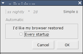
And already I’m scratching my head:
What on earth is that, and what is it doing in my title bar? If I switch windows and then try to alt-tab back, I won’t have any idea what that is. Even worse, if I opened it accidentally, I still don’t know what it is, because even if I read the “title” which has inexplicably migrated down into the window itself, I find that I am running
You know, ss nightly asterisk 28! Silly user.
Once I figure out what the window is, the single setting it exposes is straightforward enough: Should it restore my browser settings when I start up? But wait — if I uncheck this, does SessionSaver do anything at all? That’s what the extension is for, after all. And Firefox already lets me turn extensions on and off in the extensions panel itself, so what’s special here? SessionSaver had the chance to have a “simple” mode with no preferences at all, and missed.
That said, I lied to you above: there is more than one setting being exposed here. Up in the top corner we see an equivalence sign, ≡, beside the word “Simple”. That ≡ is a button that switches the preferences panel into Expert mode! Expert mode is truly a sight to behold:
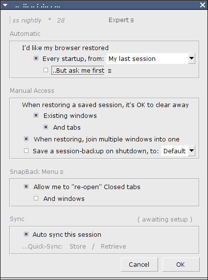
But there’s no originality that way.) The new options in the pulldown beside “Every startup, from” are “My last session” and “Default”. At first I thought this would let you choose between Firefox profiles (not that that made a great deal of sense either), but I could find no way to make anything appear in that menu other than “My last session” and “Default”. (Anyone know what it is for?)
I also like how the preference there lets me tell SessionSaver what I would like to do. I hope it is friendly and will do what I like.
You can see another ≡ beside the “…But ask me first” sub-option there. It’s another hidden menu:

Every click of the ≡ cycles through the options: “at shutdown” (which asks you if you want to save your session at shutdown or clear the saved session, not whether to restore it at startup), “startup + shutdown”, which also asks if you wish to restore on startup, and blank, which actually means “at startup”, and which prompts you to either restore or clear your saved session at startup. The application does get one thing right, by using verbs in the dialog presented on shutdown and startup when that option is enabled:
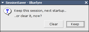
and finally it admits to being SessionSaver in the title bar. But what is “bluefyre”?
The “Manual Access” section of the preferences panel is relatively straightforward, even if the wording is a bit awkward (“clear away”, “join into one”), but then we hit “Save a session-backup on shutdown”. Is that a manual option? Is it different somehow from the “But ask me first (on shutdown)” in the Automatic section? As it turns out, it’s an automatic save, but it lets you save to a session other than the one the Automatic section uses. I still don’t know how to get it to display more than “Default” there.
The next section brings ≡ to its next level: there’s one at the end of the section heading itself, and clicking it changes the section heading from “SnapBack Menu” to “SnapBack Chronological”:

but the options in the section don’t change! It’s not two sets of options, because if I check “And windows” when the heading reads “SnapBack Menu”, and then change to “Snapback Chronological”, it stays checked — and then if I uncheck it and change back to “SnapBack Menu”, it stays unchecked! I was completely unable to figure out what difference the distinction in the section header made. One or the other or both apparently lets me “re-open” tabs and maybe windows. The scare quotes make me wonder what actually happens. I didn’t expect a session saver to do anything about re-opening tabs during a session.
Lastly, we have the Sync section, which is apparently awaiting setup but without any indication as to what needs setting up, or how to go about doing so. On a lark I clicked “(awaiting setup)”:
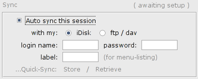
Ah, it’s a puzzle, and I found the secret door! Well, these additional options are straightforward: I can sync my sessions to an iDisk or DAV store. But even if I complete those fields, the quick-sync options stay grayed out. It turns out that those options will remain grayed out forever, because they’re not options at all — they’re buttons you can click to store or retrieve a session from the configured sync destination! Only because they turn red on mouseover did I realize that they were clickable at all.
I accidentally left “Auto sync” checked and the settings unconfigured, and was presented with this dialog, twice:
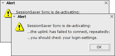
(There was apparently a sale on punctuation that day.)
I love the idea of being able to save and restore sessions, and while I could either put up with Simple mode not doing exactly what I want, or massaging the settings in Expert mode to avoid sessions being restored when I want to start fresh, but trying to navigate these preferences has informed me that I’m no SessionSaver expert. Luckily Firefox’s “uninstall this extension” feature is easy to navigate.
18 responses to “Usability Hall of Shame: SessionSaver Firefox Extension”
Wowwww! I’m sorry to laugh at your pain, but, well, I’m laughing at your pain. That’s truly awful.
It is! It’s gloriously bad!
Hah. I found reading this to be both immensely amusing and immensely sad, as I spent a week struggling with SessionSaver a few months ago, and I’m not further ahead than you are.
(see icon.)
It’s such a great idea for an extension!
What I really want is session restore only on crash or close-window, but not on file->quit.
Yeah, that was my big problem with it (crazy interface aside). I’d come into work in the morning, start up firefox, and all of a sudden I’d have 16 tabs open with yesterday’s news, some application I’d been debugging (and had since finished), some random intranet websites that I’d already read…nothing actually useful.
Restore on crash would be useful.
Even better on a laptop: I get to work and get whatever I was looking at at home the night before! That’s not always good.
*snorts*
Haven’t had that problem yet, but I could imagine.
My only equivalent to that is trying to reconnect to all my random stuff (bittorrent, IRC, IM, various possibly NSFW websites like certain parts of LiveJournal) while I’m still unwittingly connected to the work VPN and wondering why none of it is loading properly.
I use Opera. It does this naturally, without the need for installing any plug ins. It lets you reopen closed tabs and lets you start your next session with all 40 browser windows you had open last time. If it crashes while you’re writing an e-mail in Opera’s e-mail program, it’ll start with the e-mail in one of the tabs and most of the words in it.
But I am sure you have a reason for using Firefox.
Augh, no. Opera is a case study of programmer-driven usability. Opera still uses an MDI. In 2005! Even Microsoft has already admitted that MDI was a bad idea. And it’s a particularly broken MDI because they’re trying to use it to implement tabs, leading to fun like this:
Or this:
It’s the zen browser. It’s too bad the computer couldn’t figure out all on its own what I might want to do with a browser that has nothing but a big empty MDI window!
It’s improved a bit from Opera 7, admittedly, but it still defaults to having a toolbar called “Main Bar” turned off (understandably, but why is it “Main Bar”, and why is it available at all? And who uses “Open” so much in a browser that they need a toolbar button for it?):
And it tries to use a trash-can metaphor for closed windows. And a “wand” to let you save usernames and passwords! Just put your passwords in this… wand. Maybe it’s a mezuzah.
Oh, and it defaults to “Opera Native” appearance, instead of “Windows Native”. Like I said for SessionSaver, it’s no good looking like all those other apps if you can be original. (Nevermind that “Windows Native” actually uses the GTK-look widgets here on Linux.)
And of course there’s the ads, but that’s not really a usability problem per se.
“here on Linux”? You should get a Mac.
The best part about this is that you left my comment’s subject line alone.
Is that braille or something?
I have no idea! It’s the magical SessionSaver titlebar encoding!
I’d make out .. ::. .. : .:.. . … as a screwed up version of morse code? But all I can make out of it is ‘igitles’ which probably makes no sense inless that’s the creators name =P
“It’s such a great idea for an extension!”
I used to use Opera, and that was the feature I loved most: Restoring all tabs from the last session on next load.
That was the #1 thing that prevented me from jumping to FF until that extension came out!
How to Delete SessionSaver for Firefox Saved Sessions
– How?
– Just Right-click it. That’s all. There is no confirmation.
– Be careful! You could instantly delete a session by accident.
But know we know how.
>_<
Er, I mean: >_<